MPR News
Website redesign, Fall 2013 - Fall 2014
Minnesota Public Radio News is one of the nation’s most successful public radio franchises. It needed a substantial overhaul of its website to match its large digital-only reporting efforts while still keeping audio listening a first-class experience.
This is a responsive website in the truest sense of the word; it is designed to be as performant as possible. It makes use of the HTML5 history API to change page content and modify the site URLs without breaking the audio listening experience.
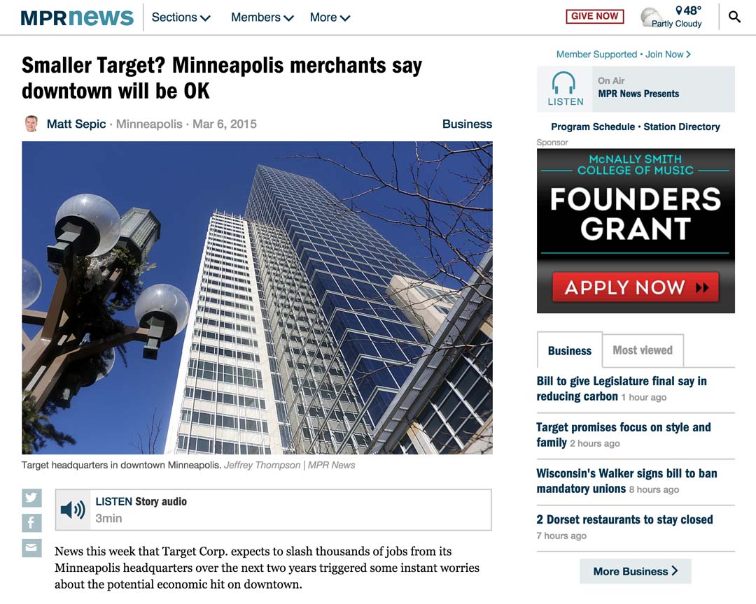
The redesigned site was implemented and rolled out in four phases to slowly transition from a domain shared with other sites to a stand-alone domain. The first phase was redesigning the story pages. Individually, story pages did not garner significant traffic, but in aggregate, the story template was responsible for most of the traffic on the site and is where the site’s content truly lives.

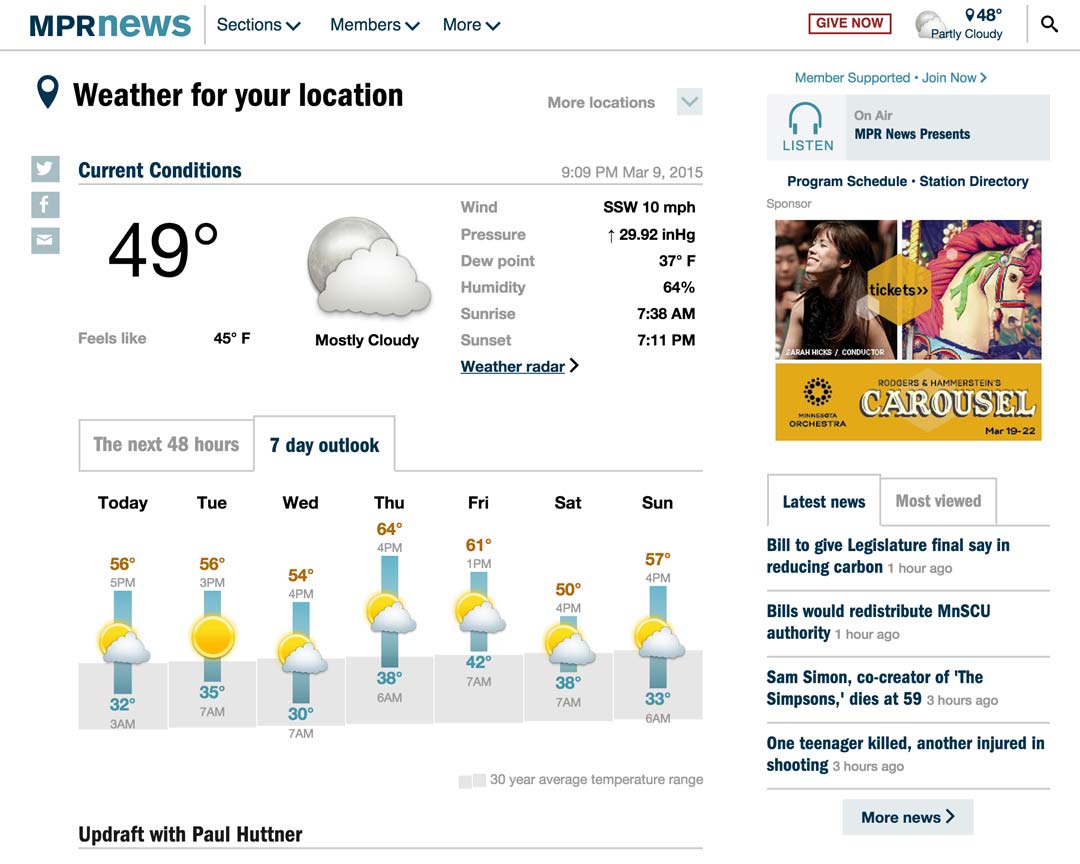
The second phase of work was redesigning the weather forecast. The new forecast features two different graphs to illustrate the short term and longer term temperature trends and reduces the at-a-glance forecast to the most useful parts. Weather data is provided via the excellent Dark Sky API.

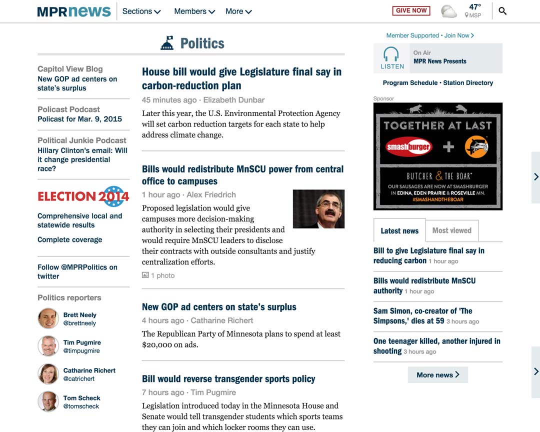
The third phase was implementing “collection” pages which list other content. These pages do not receive substantial traffic, but the data model underpinnings that were developed in this phase would be useful for the homepage. The sidebar, which appears as a rail on desktop and an off-canvas menu on mobile, gives editors the ability to highlight pieces of content and keep persistent features prominent.

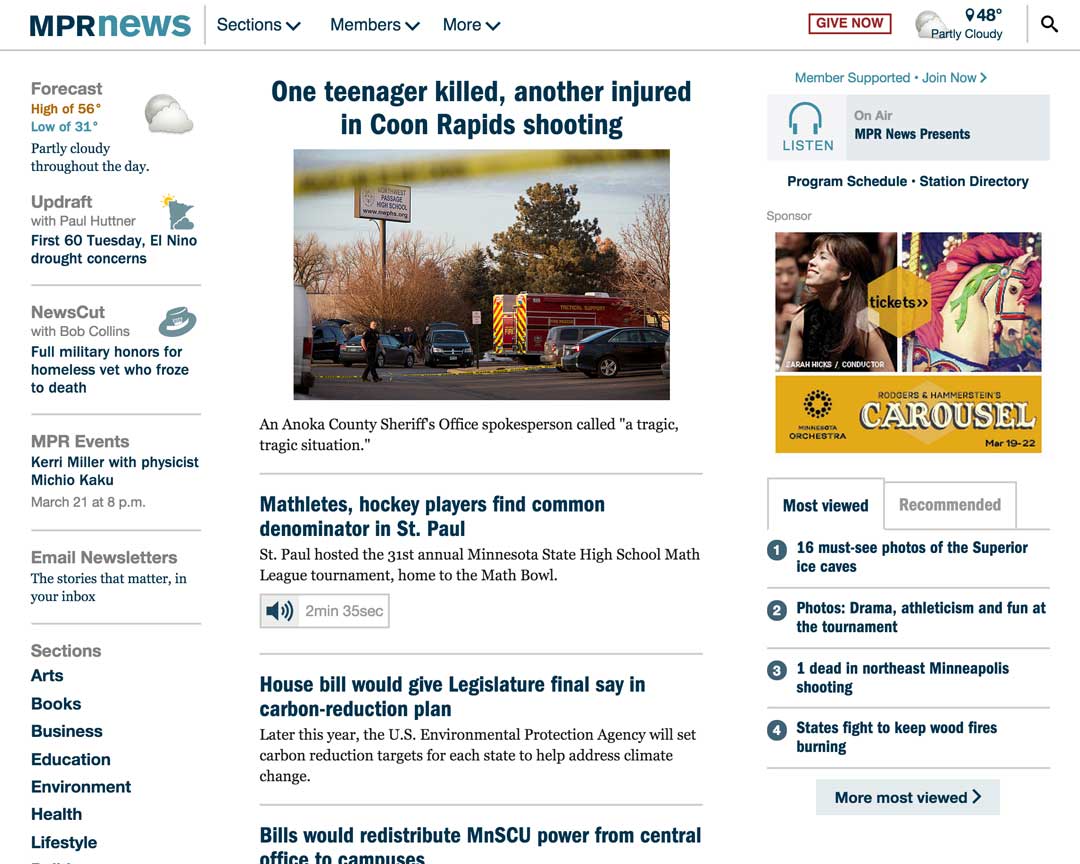
The last phase was the redesign of the homepage. Internally, this was the most attention-grabbing portion of the project, but by this point the design language had been well established and it was clear the direction the site would take. Several different priorities for stories were established that let editors finely control display, prominence and ordering. The rail for persistent sections moves to the right on tablet-sized screens and makes for a very clean experience.

On the server, Slim Framework handles URL routing and controllers, Smarty 3 is used for views/templates, and the data is provided via several internal and external REST APIs. I wrote most of the controllers, views/templates, and helper libraries. The javascript does depend on jQuery, but uses require.js and a simple routing mechanism to load only the necessary scripts depending on the URL structure. The CSS is built from organized LESS files and compiled using grunt and associated libraries.
This project is not open source, but a very early development version is available on github. This was a testbed for integrating require.js and the HTML5 history API.
Visit site